

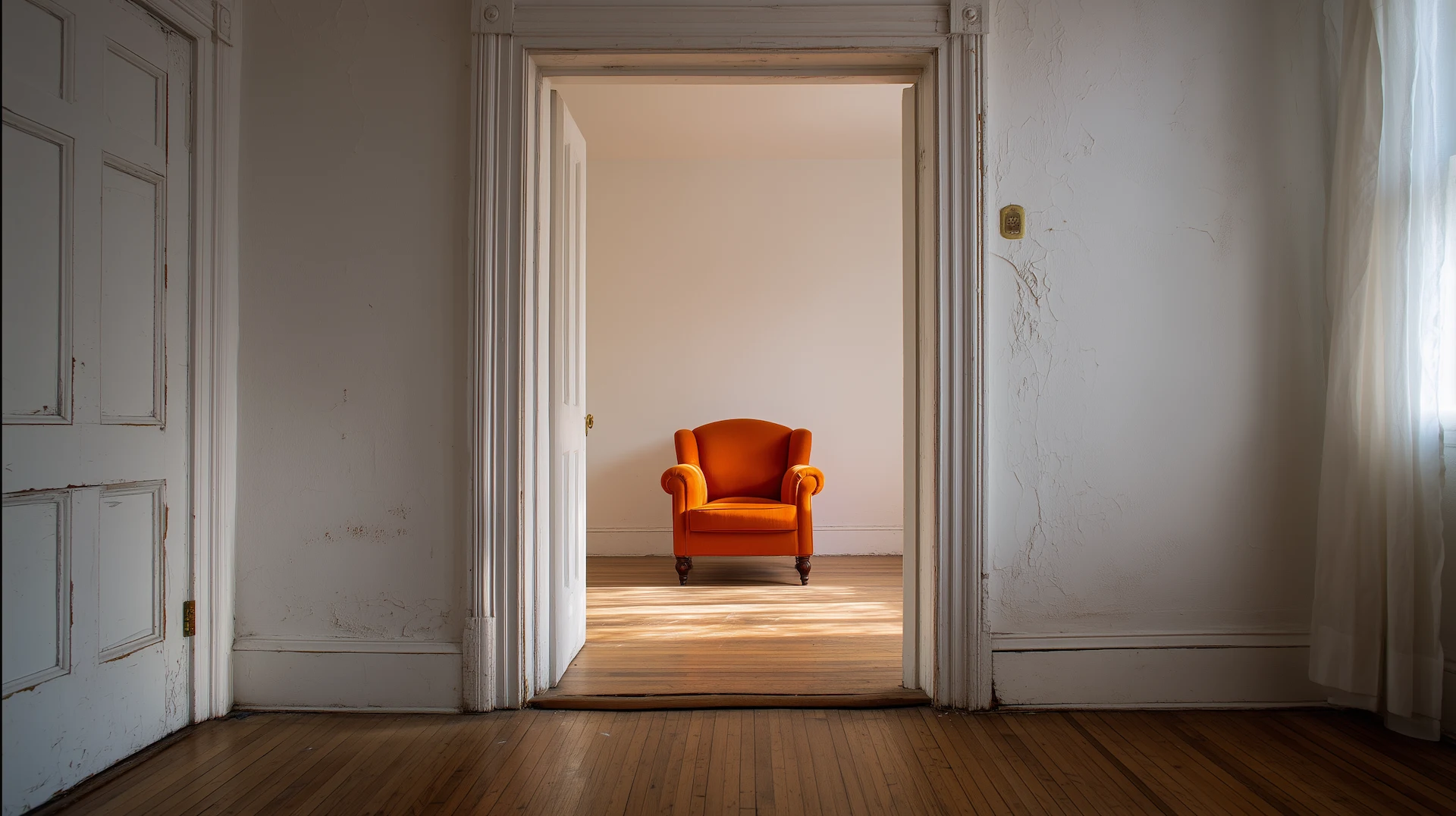
There is a moment, in nearly every conversation about interior design, when someone lowers their voice slightly and says: I could never live with all that white. And then, about three sentences later, someone else in the same conversation says: White is the only thing that makes a space feel calm to me.
Both of them are right. Neither of them has examined why.
White is the most politically ambitious color in the design world. It presents itself as the absence of a decision. The blank page, the reset button, the room before it becomes anything. And in doing so, it has convinced an entire culture that choosing it is the same as choosing nothing. That is not a choice at all. That it is simply neutral.
It is not neutral. It has never been neutral. And the fact that we keep calling it that reveals something worth sitting with.
What White Actually Does to a Room
Walk into a room painted the white that shows up on the cover of every shelter magazine, bright, cool, almost blue-toned, and notice what happens. If you are someone who grew up in spaces that were open, spare, and flooded with light, your nervous system will probably relax. The room will feel like permission. Like you can breathe. Like the thinking can start here.
If you grew up in spaces that were full, layered, fragrant, loud, colorful, warm in ways that had nothing to do with temperature, that same room may feel like subtraction. Like something has been taken away. Like the room is waiting for someone to move in. Like you are standing inside the idea of a home rather than inside an actual one.
Neither response is wrong. Both are calibrated. What you experience in a white room is a direct function of what your body has learned to read as “home,” as “order,” as “beauty,” as “aspiration.” White does not opt out of that conversation. It takes a very specific position in it.
The position it takes is this: less is more. Restraint is sophistication. The room that holds everything is already too full.
That is a philosophy. A real one, with history and class politics woven through every brushstroke.
The Anxiety Is Information
When white rooms make people anxious, design culture tends to treat that anxiety as a personal failing. A fear of commitment. An inability to “let go.” The advice is almost always corrective: learn to edit, train your eye, trust the negative space.
What that advice never considers is that the anxiety might be accurate.
A white room, at its most archetypal, is a room emptied of particularity. It signals a specific set of values: newness over history, clarity over accumulation, the visual over the tactile, the gallery over the living room. Those values are not universal. They are not natural. They emerged from a particular design tradition, at a particular cultural moment, and they have been applied with tremendous authority to what “good taste” looks like, an authority that was never equally distributed.
For people whose aesthetic inheritance includes rooms dense with objects and pattern, rooms where every surface held something that meant something, rooms where beauty announced itself rather than withheld. The white room does not read as freedom. It reads as erasure. As the room where your grandmother’s things don’t belong. As the room is asking you to be smaller, quieter, and less.
The anxiety is not irrational. It is a recognition.
Why White Feels Like Liberation to Others
This is not a takedown of white rooms. The people who love them are not wrong, either, and their reasons deserve the same honesty.
For some people, white is genuinely liberating. Not because they have been conditioned to value what design culture values, but because the rooms they grew up in felt chaotic or cluttered or oppressive in their own right. The white room, for them, is not about aspiration. It is about air. About the first breath in a space that finally matches how they want to feel.
Some people find that layered, object-heavy rooms produce the same anxiety that white rooms produce in others. The objects demand attention. The patterns compete. The fullness feels like noise they cannot turn down.
Both sets of people are responding to something real. What is not real is the claim that one response is taste and the other is preference. That one is trained, and the other is untrained. That one is designed, and the other is just not knowing better.
The design world has spent decades telling the first group that their discomfort is education they haven’t had yet. It has rarely entertained the possibility that their discomfort is knowledge about themselves, about their history, about what warmth has always looked like to them.
The Power of Naming the Default
When something is called “neutral,” it becomes the invisible baseline. Everything else is measured against it. Every other color is a departure from neutral — a risk, a statement, a commitment that requires explanation.
That’s an extraordinary amount of power to hand to a single color without noticing you’ve handed it.
Think about who benefits from white being the default. Who feels most at home in the aesthetic that gets described as timeless? Whose grandmothers’ things look right on a white-walled shelf and whose look like clutter against the same wall? Whose “maximalism” gets described as rich and curated, and whose gets described as too much?
These are design questions. There are also questions about whose sensibility gets to be the measuring stick.
None of this means white walls are bad. It means calling them neutral is a choice masquerading as a description. And like all choices that present themselves as obvious, it’s worth asking who made it, when, and in whose interest.
The Honest Thing to Call White
White is a bold color. Perhaps the boldest, because it requires the room to earn its austerity. To have enough architecture, enough light, enough considered restraint in its objects and furnishings that the absence of color reads as presence rather than vacancy. Done right, white rooms are extraordinary. They are not easy. They are not a default. They are a very specific aesthetic argument made with great confidence.
So is a room painted the deep, burnt orange of a Memphis kitchen in the early evening. So is a room covered in the kind of pattern that announces itself before you cross the threshold. So is a room that mixes three generations of furniture because every piece meant something and nothing could be let go.
These are all choices. All arguments. All positions on what a room is for and what it says about the person who lives in it.
The moment you call one of them neutral, you have ended the conversation before it begins. You have declared a winner without acknowledging the contest.
White is not neutral. It is a perspective on how to live. A compelling one for many people, and a genuinely alienating one for others — not because those others have bad taste, but because they have different histories, different bodies of experience, different inherited understandings of what beauty sounds like when it speaks at full volume.
The question worth asking is not whether you like white.
It is whether you’ve ever noticed that you were allowed to call it nothing.
Color Theory at Hooked on Hue is built on a single premise: color is always saying something. The essay you just read is about learning to hear it — even when, especially when, it has convinced everyone it isn’t speaking at all.
If this piece made you slow down and think, the newsletter was made for you. Weekly, free, and written for the reader who reads all the way to the end. One letter. One idea. The color of the week, the room worth studying, the question worth sitting with.
Subscribe Free