

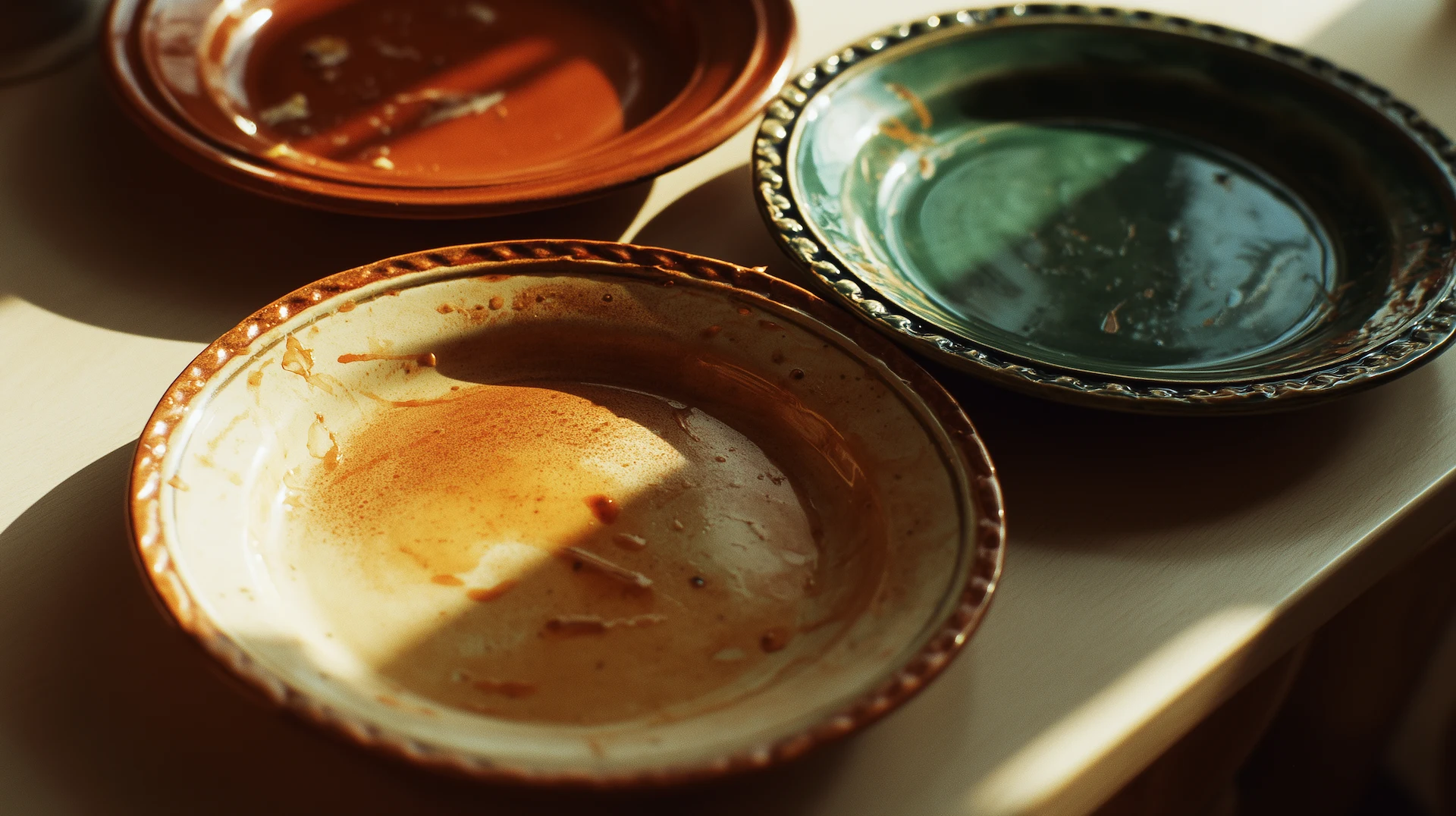
The plate is not neutral.
You have known this your whole life, even if no one ever said it plainly. You have stood in a kitchen and reached past the first stack of dishes to get to the right one. You have set a table and moved a bowl to a different spot because something was off. You have eaten the same thing twice and found that the second time, when it arrived in a different vessel, on a different surface, in different light, it tasted slightly better. Not because the food changed. Because the experience of the food changed. Because perception is not a passive act, and the conditions under which we receive something shape what we receive.
This is not sentiment. It is science. And it is also, if you are paying attention, an argument about design.
Food psychologist Charles Spence and colleagues at Oxford published research that made food manufacturers and restaurant designers sit up straight. The findings were specific and a little unsettling: the color of a container changes how sweet, salty, or bitter its contents taste. Strawberry mousse eaten from a white plate was rated significantly sweeter and more flavorful than the same mousse eaten from a black plate. Hot chocolate served in an orange cup tasted richer than the identical drink in a white or red cup. These were not fringe findings. They replicated. They held across cultures. The plate, the cup, the bowl. Each is an argument the eye makes to the brain before the tongue has weighed in.
What Spence was measuring in a laboratory, cooks and hosts across every culture have known through practice for centuries.
Japanese kaiseki is the most formally deliberate food presentation tradition in the world. Every element of a kaiseki meal is intentional to a degree that makes Western table-setting look improvisational by comparison. The vessel is selected before the dish is conceived. The color of the lacquerware, the weight of the ceramic, the depth of the bowl, the way a leaf is placed at the corner of a plate, all of it is part of the meal. Not decoration. Not garnish. The meal itself. The underlying principle is that food exists in relationship to its container, and that relationship communicates something. A chef who ignores the vessel is a composer who ignores the silence between the notes.
The French bistro took a different approach and arrived at a similar conviction. The white plate is the great equalizer and the great revealer. It was not chosen by accident. On a white surface, color is amplified. The deep red of a wine-braised short rib becomes more itself. The green of a watercress garnish earns its oxygen. The brown crust of a roasted chicken announces its texture before you have tasted it. White is not absent. On a plate, white is a decision that says: look at what is here. The food is the entire argument. Nothing else is competing.
These are not aesthetics-for-aesthetics’-sake traditions. They are traditions built on the understanding that how food is presented is inseparable from how food is experienced. The plate is the frame. The frame changes the painting.
There is a specific memory behind every piece of HoH writing about food, and it is not subtle. It is loud. It is a Sunday table in Memphis, where my grandmother made abundance look effortless, and every meal looked like a celebration, whether or not the occasion called for one. The table was always colorful. Not because anyone was following a design philosophy. Because color, in that house, was how you showed up. The deep cranberry of a pressed tablecloth. The green glass of a serving dish that had been in the family for thirty years. The gold edge on the plates only came out for Sunday. Flower patterns and mismatched platters and napkins that were too big, folded with precision anyway. The food on that table always tasted like something. It tasted like the effort of being loved.
I could not have articulated at eight years old what I was absorbing. But I was absorbing it: that the surface food sits on is a statement. That presentation is not vanity. That the care you put into how a meal looks is part of what the meal means.
This is the argument the food world has been making obliquely for decades in its fixation on plating technique. It is the argument behind the rise of the wide-rimmed bowl, the return of hand-thrown ceramics, the very particular quality of light in a restaurant where someone spent significant money making sure the food looks its best before it arrives at the table. The argument is not that beauty makes food taste better, exactly. The argument is that beauty prepares you to receive the food correctly. That presentation is a signal, and the signal changes the experience.
Some conversations belong in a letter.
Hue & Human — weekly, free, written for the reader who goes further.
A meal on a paper plate is still a meal. But something about it tells the brain this is provisional. This is temporary. This does not require your full attention. A meal on a plate someone chose deliberately, in a color that holds the food rather than competes with it, tells you something different. It says: this was prepared for you. Someone decided this. Be here for it.
That is a designed experience, whether or not the word design was ever used.
The practical question that follows all of this is the one that separates curiosity from intention. You now know the plate is not neutral. You now know that what food sits on shapes how it is received. So, what are you choosing?
This is not a prompt to go acquire a complete set of matching ceramics. It is a prompt to stop treating the vessel as an afterthought. The deep blue bowl that makes a simple grain salad look considered. The terracotta dish makes roasted vegetables look like something ancestral and warm. The stark white plate that makes anything placed on it take itself seriously. The mismatched set of dishes your grandmother collected over forty years ago that, together, look like a life.
These are not neutral choices. They are design choices. They are the choices of someone who has decided that a meal is worth showing up for completely.
You have been setting a table your entire life. You have been making decisions about color, surface, light, and arrangement every time you brought food to the table — consciously or not. The only question that design ever asks is whether you will make those decisions on purpose.
The plate is not neutral. It never was. The question is what you want it to say.
If this piece made you slow down and think, the newsletter was made for you. Weekly, free, and written for the reader who reads all the way to the end. One letter. One idea. The color of the week, the room worth studying, the question worth sitting with.
Subscribe Free